
Bengaluru, IN
Hive
- User Research
- Branding
- Moodboard
- Color Palette
- Discovery & Strategy
- Branding
- Moodboard
- Color Palette
Hive is an innovative lodging concept, offering a unique blend of luxury hotel comfort and the warmth of a private home.
The logo should capture the essence of this hybrid experience, symbolizing the harmonious coexistence of sophistication and homeliness.
Understanding the Essence: We began by immersing ourselves in the concept of HIVE — a fusion of luxury hotel sophistication and the comfort of a private home. Our goal was to capture the harmony between these contrasting elements.
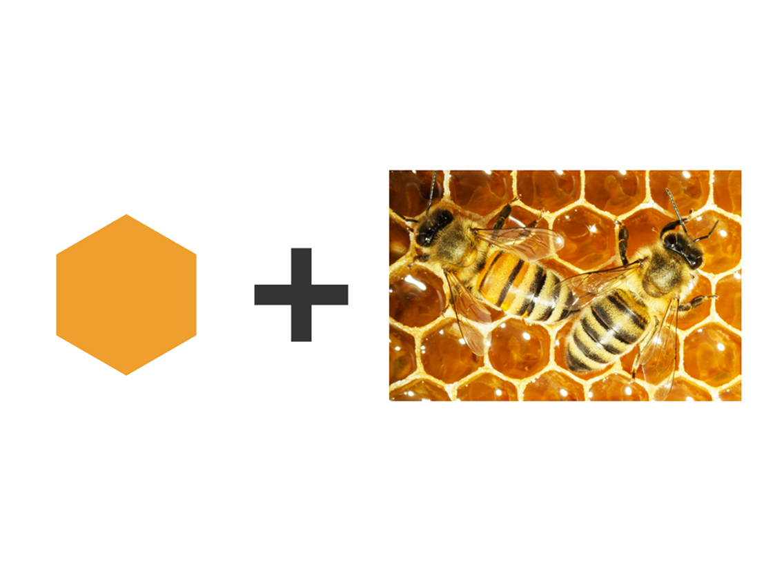
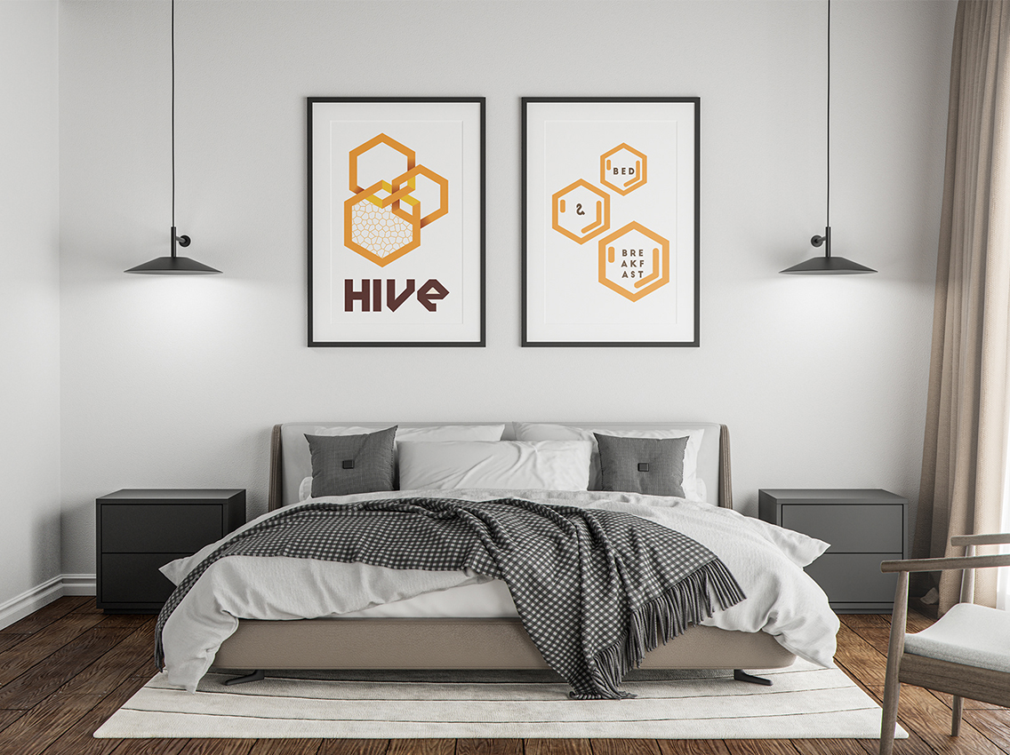
Moodboard Creation: Our moodboard reflected the key themes of community, sophistication, and homeliness. Bees and honeycombs symbolized organization and sweet experiences. Warm, inviting colors like gold and amber were chosen to convey richness and comfort. Imagery of elegant hotel interiors and cozy home settings provided inspiration.
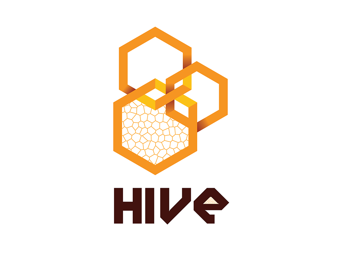
Conceptualizing the Logo: We translated moodboard insights into a modern, clean logo that encapsulates the essence of HIVE. The incorporation of subtle bee elements and honeycomb patterns ensures a visual narrative that resonates with the brand's values.
Color Palette Selection: Our chosen color palette — a blend of gold, amber, and soft neutrals — creates a visual language that communicates both luxury and homeliness. This carefully curated palette reinforces the brand's unique positioning.
Typography: The selected font strikes a balance between contemporary aesthetics and a welcoming feel, mirroring the duality of HIVE's lodging experience.
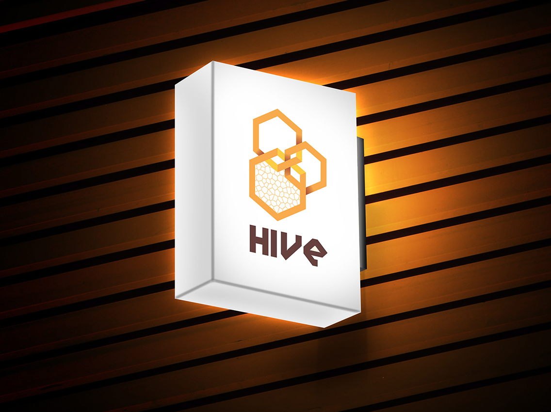
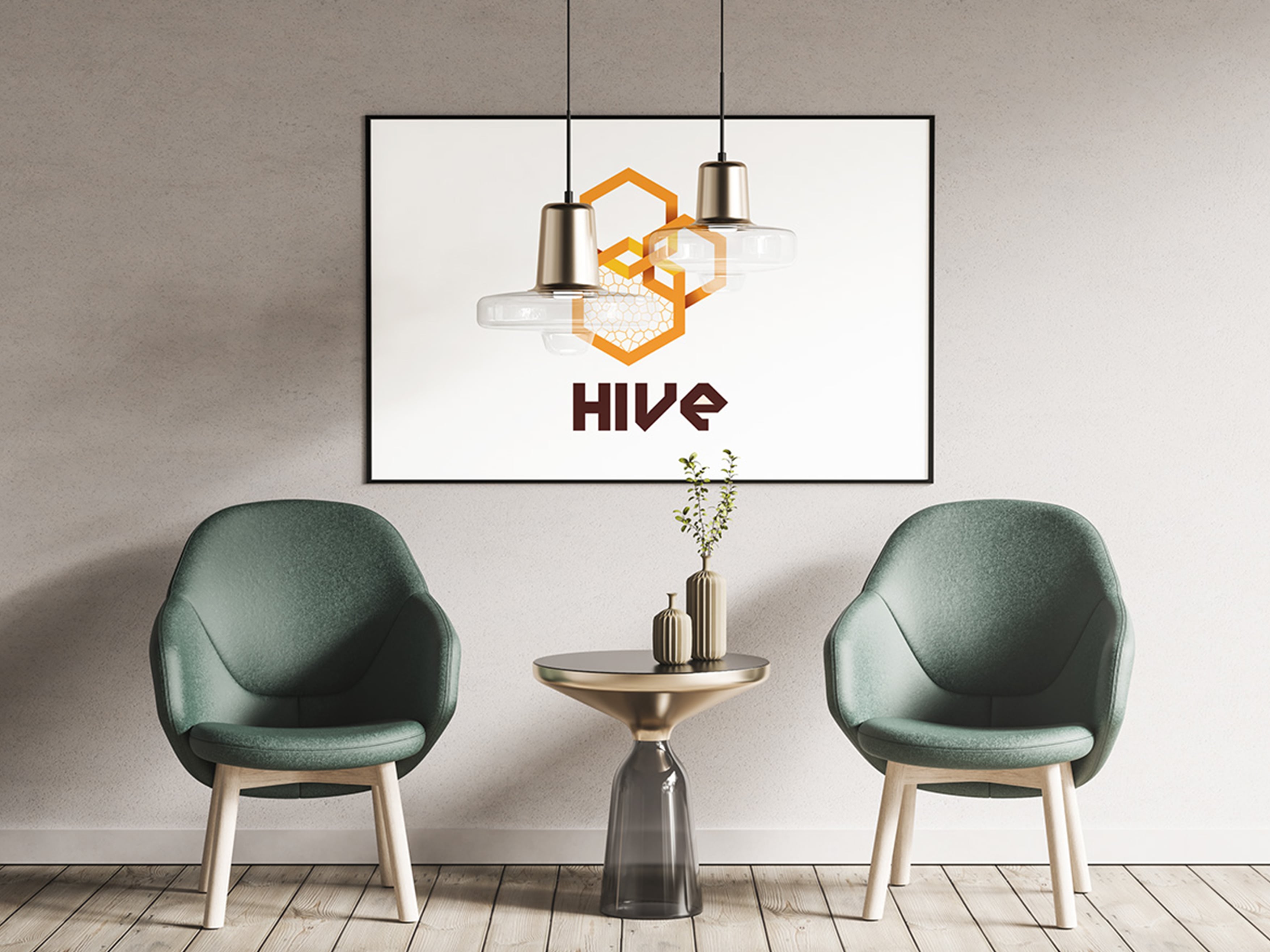
Mockup Presentation: To provide a tangible preview of the logo in action, we created mockups showcasing its application across various touchpoints. From business cards to digital platforms, the logo seamlessly integrates into the brand's identity.
Discover.
- Encapsulate and reflect the essence of the brand
- Recognizable across various platforms and scales
- Offering a unique and distinctive visual representation of the brand
- Brand Identity Reflection
- Simplicity and Versatility
- Visual Harmony


The HIVE logo design case study is a testament to our commitment to translating abstract concepts into visually compelling brand identities. By understanding the core essence of HIVE, we successfully crafted a logo that captures the brand's unique proposition — a blissful lodging experience that combines the best of luxury and homely comfort.
Look at My
Products.


Let’s Work
Together.
